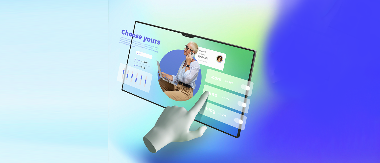
Responsive Web Design That Clicks Everywhere
Ever landed on a site that just feels right on your phone, tablet, or laptop? That’s what we do. We create websites that don’t just shrink to fit — they adapt, adjust, and feel natural on any screen. Whether your audience is scrolling from the couch or clicking through at the office, your site will look sharp, load fast, and feel effortless to use. Think flexible layouts, fluid grids, and smart visuals that respond instantly to every touch, click, or swipe. No awkward zooming. No clunky navigation. Just smooth, seamless experiences your visitors will love. Want a website that works beautifully everywhere your audience is? Then give us a call!
Recognized by Trusted Platforms
Our responsive design services are highly rated and recommended by clients on well-known review platforms.
Our Approach
As a renowned responsive designing company, we do not just build responsive websites—we craft seamless digital experiences. Our process starts with understanding your business, audience, and goals so that every design element is intuitive and impactful. We create fluid layouts that adjust flawlessly to any screen size, from desktops to smartphones, guaranteeing a consistent and engaging user journey.
Our expert team uses cutting-edge frameworks, smart coding practices, and rigorous testing to optimize speed, performance, and accessibility. The result? A stunning, high-performing website that enhances user experience and drives real business results.
CONTACT US
Fluid Grid Layouts
A fluid grid layout is the backbone of responsive design. Instead of fixed widths, it uses relative units like percentages to adapt content to different screen sizes. This flexible structure ensures your website looks and functions perfectly. Whether on a desktop, tablet, or smartphone, it provides users with a seamless experience no matter how they choose to browse. So, investing in responsive design is worth every penny!
Contact Us
Flexible Images and Media
Responsive design isn’t complete without media that adapts smoothly. Flexible images and videos scale within their containers to prevent breakage or distortion across devices. This approach ensures visual content looks clean and professional, improving load times and enhancing overall usability. By optimizing media responsiveness, you maintain visual consistency without compromising performance or user experience.
Contact Us
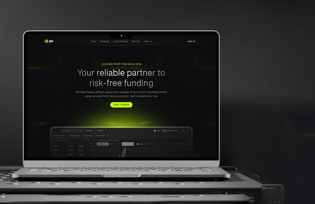
What Makes Responsive Design Unavoidable
A responsive website isn’t just about looks—it’s about performance, accessibility, and business growth. With more users browsing on mobile devices, a seamless experience across all screen sizes is essential for engagement, SEO rankings, and conversions.
CONTACT USWhat We Offer
Our responsive design services ensure your website looks and functions perfectly on all devices—desktops, tablets, and smartphones. We focus on fluid layouts, flexible images, and media queries to create seamless user experiences.
From landing pages to full-scale e-commerce platforms, we design with speed, accessibility, and mobile-first performance in mind—helping you reach and retain users wherever they are.
Our Technological Excellence
We combine innovation with precision to build flawless, responsive designs. Our expert team leverages the latest technologies to ensure seamless adaptability, fast performance, and an engaging user experience across all devices. It empowers businesses to thrive in the digital world.


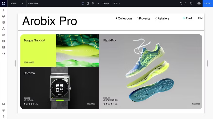
Responsive Gallery
Coopavel – Cooperativa Agroindustrial
We helped Coopavel update its website with a clean and simple design that works great on any device. Now, their visitors can find what they need faster, and the site looks just as good on a phone as it does on a computer.
Visit Site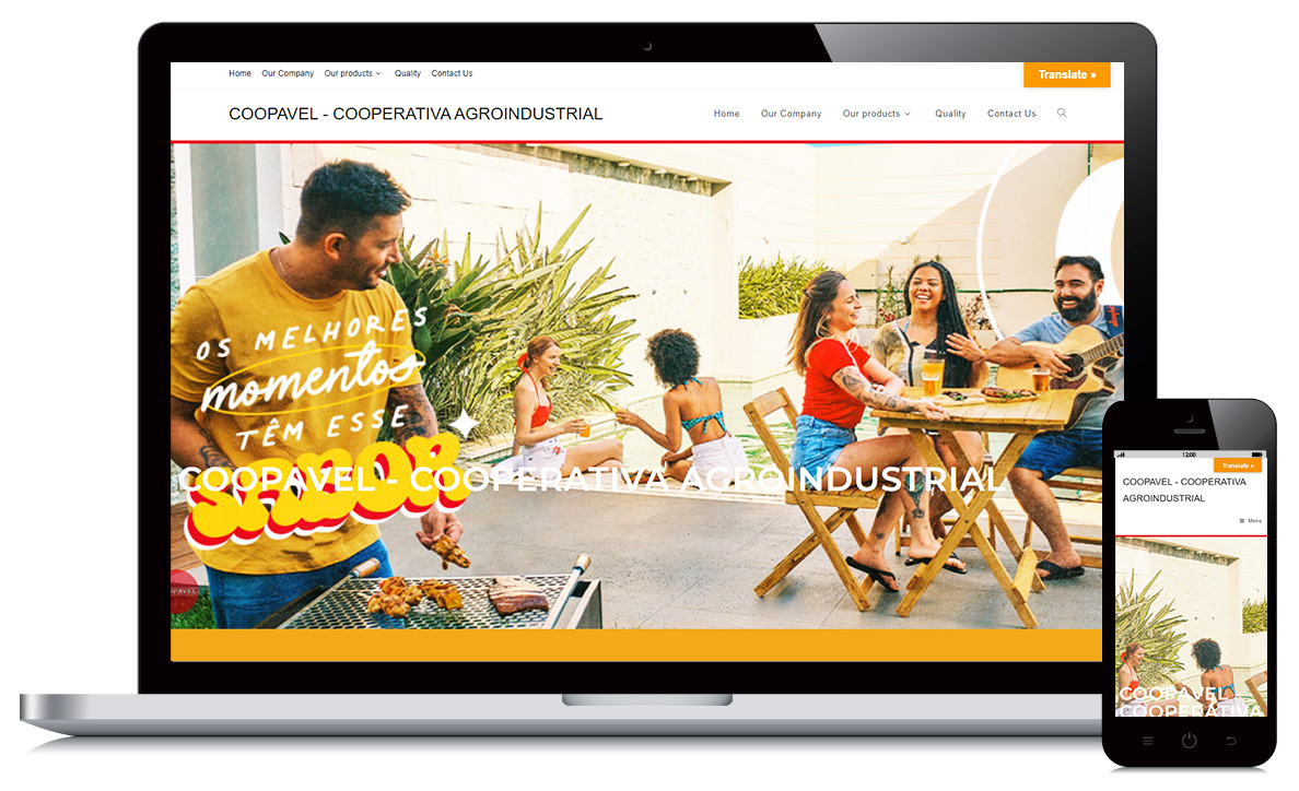
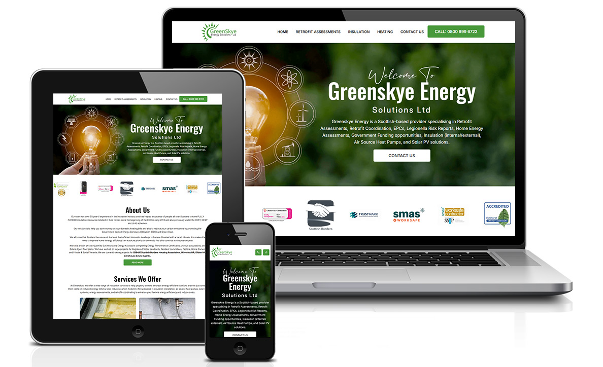
Greenskye Energy
Greenskye Energy wanted a site that reflected their focus on clean energy. We created a responsive design that’s easy to navigate and looks great everywhere—making it easier for people to learn about their work and get in touch.
Visit SiteOlimpia Curtains
Olimpia Curtains needed a fresh look for their website. We designed a modern, mobile-friendly layout that shows off their curtain styles beautifully and makes it easy for customers to browse and reach out.
Visit Site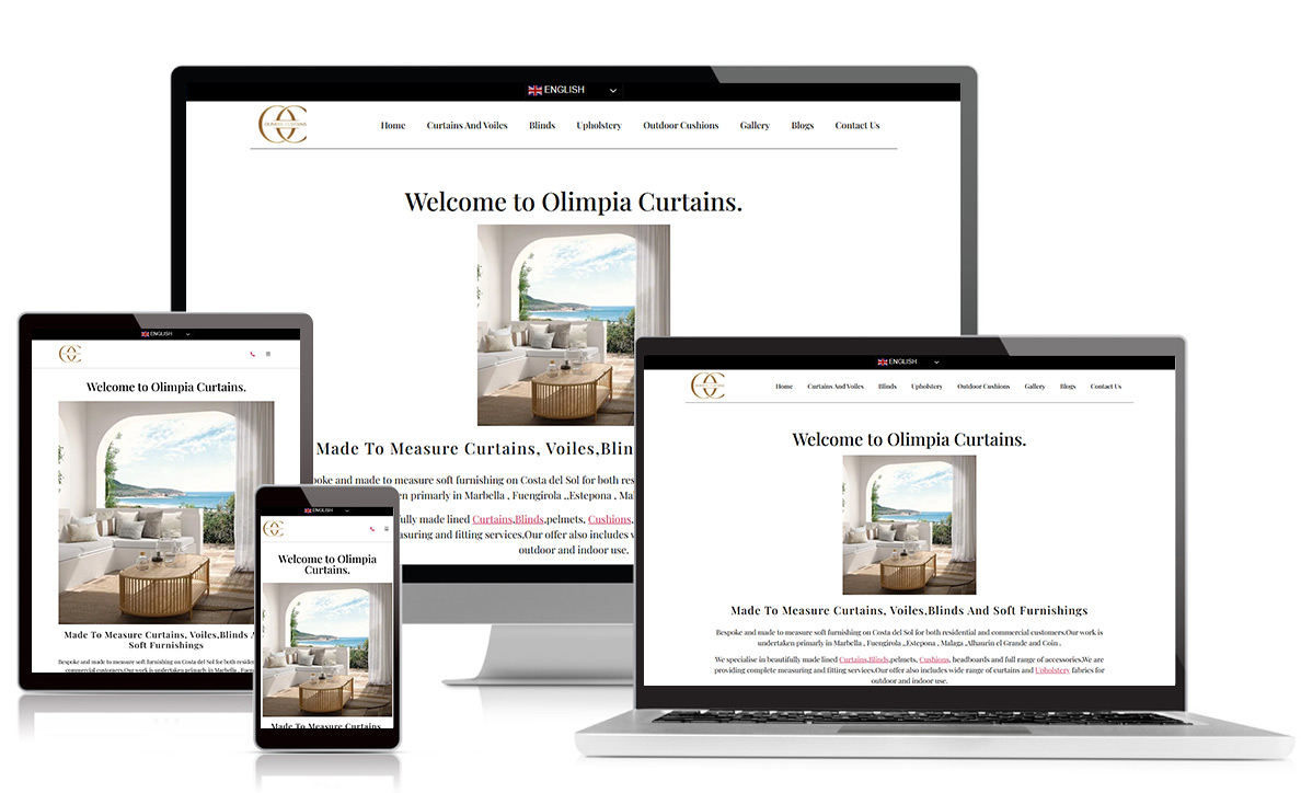
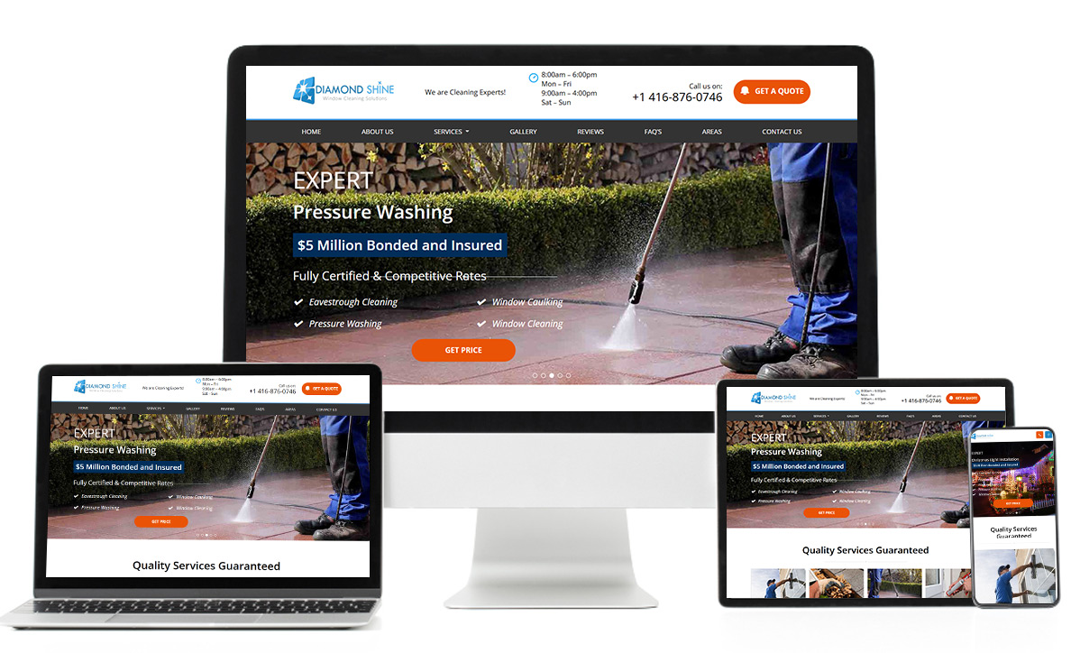
Diamond Shine
For Diamond Shine, we built a responsive website that’s simple, clean, and easy to use. Whether customers visit on a phone or a laptop, they can quickly learn about the services and book with ease.
Visit SiteHeatons Painter
Heatons Painter wanted something that looked professional but was also user-friendly. We gave them a responsive website that shows off their painting work clearly and makes it easy for people to request a quote from any device.
Visit Site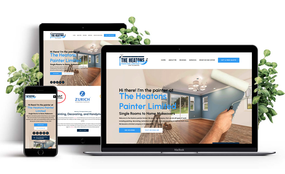
Want to create a consistent user experience?
Do you wish to create a seamless experience across all devices? Numone Technologies is here to craft responsive designs that adapt flawlessly to any screen for fast, engaging, and user-friendly interactions that keep your audience connected and satisfied.
Notable Projects From Different Industries
We’ve partnered with businesses of all sizes, from startups to global enterprises, and delivered seamless, high-performing responsive designs. Our expertise spans industries like eCommerce, healthcare, finance, and technology, so every website adapts flawlessly across devices. We craft digital experiences that drive engagement, conversions, and long-term growth.
Have any doubts or queries in your mind?
Common Frequently
Asked Question
Responsive design ensures your website works seamlessly across all devices. In today’s digital world, it’s essential for user experience, as more people access websites through smartphones and tablets. Our company specializes in building responsive websites that adapt to any screen size to provide your users with the best experience possible.
Our goal is to make your website future-proof, user-friendly, and easy to navigate. We take pride in delivering design solutions that scale with your business and evolve with changing technologies.
Explore some frequently asked questions about the responsive design below to better understand this service:
Responsive design ensures that your website adjusts automatically to fit any screen size, from mobile phones to large desktop monitors. It’s vital because it enhances user experience and helps with SEO rankings, as search engines prioritize mobile-friendly websites.
Not at all! Our team will ensure that your website maintains its original branding and design elements while being optimized for various screen sizes. The layout will adjust smoothly without losing any design integrity.
The time depends on your website’s complexity and features. On average, responsive design can take anywhere from a few weeks to a couple of months to implement. We ensure the process is smooth and efficient to meet your needs.
Absolutely! After we implement the responsive design, you’ll have full control over your content. We’ll ensure the design is easy to manage and update, so your website remains fresh and relevant across all devices.
Reviews from Our Customers
We’ve had the pleasure of working with some incredible clients. Their feedback is our greatest reward. From efficient project management to top-notch quality, our customers appreciate the dedication we put into every job. It’s always gratifying to know we’ve helped them achieve their goals and exceed expectations.
Read our 5 Star reviews and see what our clients say about us!
ForThe Record
a week ago
I'm a Canadian business owner and I have dealt with a lot of outsourcing for many of my businesses. One such work involved a website for a business that I run in canada. To be honest, I had two companies from India both greatly disappointed me and one wasn't very honest. I was completely put off by contracting further tech company in India.
This company reach out to me very adamantly and I decided to give it a chance. Annie was assigned to look after my website and I can say with without reservation that her results are beyond expectation.
She is a very diligent, always answers your needs, always perforn to the best of her ability and always willing to go the extra mile to please you.
Her team is a very dedicated unit and never forgets to do what you requested. Not only am I keeping this company but I'm also expanding further projects with them in the near future.
My revamped website looks great and this company has my trust.
Dalzell Design Landscaping
2 Weeks Ago
This company has been doing our SEO work and maintaining our websites for multiple businesses. They took over a mess that our last guy left us. It has been a process but they are working hard towards building our online reputation again. They are super responsive and I love that they work at night and I can see what they have done in my early morning routine.
Great job guys
Shawna Kunselman
a Weeks Ago
Highly recommend this company. Great work and great communication. I’ve seen an increase in website traffic after just a few weeks.

Brendan Mon tanner
28 June 2024
Nemone technology is a great company that gets the Done. very professional and fully recommended.
Stanlee Hospitality
2 July 2024
I had a fantastic experience with Numone Technologies! Numone Technologies exceeded my expectations!They are hands down the best digital marketing agency in Kolkata. From the moment I reached out to them, their team was professional, responsive, and truly understood my business needs.
Shawna k
28 June 2024
Great service and excellent communication. Already seeing results after just a few weeks.
Great job guys

Why People Keep Coming Back to Us
As a trusted destination for responsive designs, we really feel glad because our clients trust us for their valued websites. Our clients return because of our commitment to delivering outstanding responsive designs that elevate their digital presence. Here are the primary reasons why our clients are so confident about us:
01
Expert Craftsmanship
We approach each project with meticulous care, ensuring your website looks perfect on any device. Our designs combine functionality with aesthetics, providing seamless navigation across all platforms while enhancing user experience.
02
Client-Centered Solutions
We prioritize your needs by offering tailored responsive design strategies. Our focus is on understanding your vision and goals, delivering custom solutions that adapt to your business needs, and ensuring long-term success.
03
Ongoing Innovation
With an ever-evolving digital landscape, we stay ahead of the curve. Our team continuously adapts to the latest trends and technologies, ensuring your website remains optimized, functional, and ahead of the competition.
Get in Touch with Us & Create Something Magical!
We're ready to hear from you and eager to assist. Send us a message, and we'll respond as soon as possible! Looking forward to connecting soon.
START YOUR PROJECT